True character consistency isn’t about tracing, but about mastering a visual language to tell a better story.
- It involves codifying a character’s “emotional thumbprint” directly into your script before drawing a single line.
- It leverages disciplined muscle memory, much like a musician learning a fretless instrument, to make consistency second nature.
Recommendation: Build a “Style Bible” not as a set of restrictive rules, but as your artistic permit to create with confidence and narrative impact.
As a comic artist, you know the feeling. Your hero, so clear in your mind, starts to look like a distant cousin by page five. By page ten, they’re an unrecognizable stranger. This struggle, where a character looks different in every panel, is one of the most common and frustrating hurdles in creating a graphic novel. The standard advice is always the same: create a model sheet, practice more, and pay attention to detail. While not wrong, this advice treats character consistency as a purely technical chore of replication.
But what if that’s the wrong way to look at it? What if consistency isn’t a tedious task, but the very grammar of visual storytelling? The real key lies not in just drawing the same face over and over, but in understanding and codifying your character’s entire visual being—their unique visual timbre. This includes their posture, their specific way of expressing emotion, and their unmistakable silhouette. This is about building a consistent person on the page, not just a consistent drawing.
This editorial guide will reframe consistency as your most powerful narrative tool. We will move beyond the basics to explore how to build this visual grammar from the ground up, starting with the script itself. We’ll analyze how consistency creates suspense, how it allows art to speak without words, and how it transforms static scenes into dynamic interactions. We’ll even draw lessons from unexpected fields like music and public art to show that the principles of consistency are universal. By the end, you will see consistency not as a cage, but as the foundation upon which powerful, deliberate, and emotionally resonant storytelling is built.
To navigate this deep dive into visual narrative, the following guide breaks down the core components of mastering character consistency. Each section builds upon the last, offering a comprehensive blueprint for any artist ready to elevate their craft.
Summary: A Blueprint for Character Consistency in Graphic Novels
- Why Is the Last Panel on the Right Page the Most Critical for Suspense?
- How to Script a Scene Visually Before Drawing a Single Detail?
- Show or Tell: When Should You Remove the Caption and Let the Art Speak?
- The “Static” Mistake: Why Two People Just Standing and Talking Kills the Momentum?
- How to Change Color Palettes to Signify a Flashback?
- Bridge or Verse 3:Why Is Learning Violin After 30 Considered the Ultimate Musical Challenge?
- How to Design Stage Visuals That Look Good on Livestreams?
- How to Paint a Mural on a Public Wall Without Getting Arrested?
Why Is the Last Panel on the Right Page the Most Critical for Suspense?
The last panel on a right-hand page is the most powerful piece of real estate in your comic. It’s the final beat the reader experiences before the physical act of turning the page, creating a moment of built-in suspense. Character consistency is the engine that drives the impact of this moment. Throughout your preceding 19 pages, you’re not just telling a story; you are teaching the reader your character’s visual language—their predictable reactions, postures, and expressions.
This established pattern forms a baseline of expectation. The reader learns what your character looks like when they are confident, afraid, or lying. When you arrive at that critical final panel, you can leverage this consistency for maximum effect. The most powerful page-turns are not about showing a monster or an explosion, but about a subtle, deliberate break in the character’s established visual pattern. This is what creates true narrative tension.
This systemic break creates a form of cognitive dissonance in the reader. If a consistently stoic character suddenly displays a flicker of fear, or an honest character’s signature “tell” for lying appears for the first time, the reader feels it instantly. The suspense comes from the question this break raises: “Why did they react differently *this time*?” It’s a quiet cliffhanger, made possible only because you spent 19 pages building a reliable visual grammar for your character. Without consistency, a change in expression is just another drawing; with it, it’s a bombshell.
How to Script a Scene Visually Before Drawing a Single Detail?
Most artists think of consistency as a drawing problem. It’s not. It’s a planning problem, and the solution begins in the script. A professional comic script is more than dialogue and action; it’s a visual blueprint. To ensure consistency, you must script a character’s acting and emotional state with the same precision as their words. This means moving beyond “She looks sad” to defining *how* your specific character performs sadness.
This is where you define each character’s unique “emotional thumbprint.” This is their specific, consistent library of expressions and body language. For example, one character might express anger with a clenched jaw and narrowed eyes, while another might adopt a forced, unsettling smile. Documenting these choices in the script, panel by panel, transforms consistency from a hopeful accident into a deliberate authorial choice. It serves as a constant reference point for you, the artist, ensuring the character on page 15 acts and reacts within the same “rules” as the one on page 2.

Your script can include a dedicated “Consistency Check” column. For each panel, you’d note critical elements to maintain: a fresh scar from a previous scene, a torn shirt, or, most importantly, the specific emotional beat. Thumbnailing, the next stage, then becomes less about just composing a shot and more about tracking the flow of this visual data. It’s at this early, low-investment stage that you catch inconsistencies in posture and gesture before they are locked into a final drawing. This process ensures the character’s performance is as consistent as their physical design.
Your Action Plan: Auditing Character Consistency
- Points of Contact: List all visual signals your character emits (posture, facial tics, key features, color anchors).
- Collection: Inventory your existing panels. Do these signals appear consistently in similar emotional contexts?
- Coherence: Confront your character’s visual language with their core personality traits. Does their “angry” look align with their established character?
- Memorability: Identify the single most unique visual element of your character. Is it consistently rendered and immediately recognizable?
- Integration Plan: Create a priority list of 1-3 inconsistent visual elements to correct in future pages, starting with the most narrative-breaking.
Show or Tell: When Should You Remove the Caption and Let the Art Speak?
The ultimate goal of sequential art is to “show, not tell.” Captions and thought bubbles are narrative tools, but they can easily become a crutch, explaining what the art should be conveying. The decision to remove a caption is a direct test of your character’s consistency. You can only let the art speak for itself when you have taught the reader how to interpret it. A silent panel is an earned moment, and that earning comes from rigorous consistency.
When a character’s “emotional thumbprint” is well-established, their posture, silhouette, and expression can carry the entire narrative weight of a scene. A professional artist leverages this by creating powerful moments of silence where the reader understands a character’s internal state purely through visual cues. For example, if you’ve consistently shown a character fiddling with a cufflink when nervous, a single, silent close-up panel of their hand doing just that can scream anxiety more effectively than a caption box ever could.
This technique allows for profound subtext. You can use the “Contradictory Channel” method, where a character’s dialogue says one thing (“I’m fine”) while their consistent, established body language says another (their shoulders are slumped in their typical “defeated” pose). This creates a rich, layered reading experience. The reader feels the dissonance and understands the character’s true feelings without being told. But this moment is only possible if the “defeated” pose is a consistent, reliable signal. Without that foundation, it’s just a drawing of someone slouching. With consistency, it’s storytelling.
The “Static” Mistake: Why Two People Just Standing and Talking Kills the Momentum?
One of the deadliest momentum killers in a graphic novel is the “talking heads” scene: two characters standing still, exchanging dialogue. While some exposition is necessary, its visual presentation cannot be static. In a market where graphic novel sales have quadrupled since 2010, reader expectations for visual dynamism are higher than ever. Character consistency is the key to transforming these static scenes into compelling, character-revealing moments.
A dynamic scene is not about adding explosions; it’s about “character acting.” Even in a quiet conversation, characters are doing things. They are shifting their weight, fidgeting, or interacting with their environment. These micro-actions, when consistent with the character’s personality, reveal their internal state. A nervous character might polish a button on their coat. A dominant character might invade the other’s personal space, leaning on objects near them. This turns the environment into a stage for their relationship.
By defining and consistently applying these behavioral tics and postures, you create visual tension. The composition becomes a metaphor for the power dynamics at play. Instead of two symmetrical, neutral figures, you have opposing forces expressed through body language. The scene is no longer just about the words being said, but about the unspoken story told by the characters’ consistent, physical presence.
The following table illustrates how to inject this dynamism through consistent character acting, turning a flat scene into a narrative-rich interaction.
| Static Approach | Dynamic Solution | Visual Impact |
|---|---|---|
| Two characters standing still | Character A constantly polishes a button (nervous tic) | Reveals anxiety through micro-actions |
| Neutral body positions | Defensive posture vs. aggressive lean | Creates visual tension through opposition |
| Ignoring environment | One character paces, other leans on objects | Space becomes a metaphor for the relationship |
| Symmetrical compositions | Asymmetrical positioning with consistent character traits | Movement is implied through imbalance |
How to Change Color Palettes to Signify a Flashback?
Color is one of the most powerful tools for narrative signaling, and its consistent application is crucial for guiding the reader through temporal shifts like flashbacks. Changing the color palette is a classic technique, but its effectiveness hinges on a clear and consistent system. An arbitrary shift to sepia-tone can feel cliché; a thoughtful, consistent color strategy feels intentional and enhances the story.
A professional approach involves establishing a “color rule” for flashbacks and applying it rigorously. This might be a desaturated palette, a monochromatic wash (like a cool blue), or a limited set of muted tones. The key is that the audience learns to associate this specific look with a shift in time. However, true mastery lies in what you keep consistent *within* that changed palette. The most important element to maintain is the character’s signature color.

This signature color acts as a temporal anchor. For example, if your hero is defined by a bright red scarf, that scarf should remain a saturated red even when the rest of the flashback scene is rendered in muted blues. This immediately tells the reader two things: we are in the past (muted background) but we are still following our hero (the anchor color). This technique allows for instant recognition and maintains a strong visual connection to the character across different timelines. You can then create a powerful moment of revelation by intentionally breaking this rule for a single, critical panel, signaling a change in the character’s past.
Bridge or Verse 3:Why Is Learning Violin After 30 Considered the Ultimate Musical Challenge?
This question, seemingly from a completely different world, holds the single most important lesson for an artist struggling with character consistency. The challenge of learning a fretless instrument like the violin late in life is not primarily physical; it’s about muscle memory. An adult learner has to fight against years of ingrained, imprecise motor habits. To play in tune, they must develop a new, hyper-precise form of muscle memory through thousands of repetitions, until their fingers land on the exact right spot without conscious thought.
Drawing a character consistently is the artistic equivalent of playing a violin in tune. As an artist, you have also spent years developing your own set of drawing habits. When you create a new character, you are not starting from a blank slate. You are fighting your own ingrained tendencies to draw eyes a certain way, or to shape a jawline along familiar lines. This is why a character can look so different from panel to panel; your old habits are interfering with the new design.
As artist and educator Tom Hart of the Sequential Artists Workshop notes:
Drawing a character correctly from any angle without reference is a skill drilled through repetition, just like finger placement on a fretless instrument.
– Tom Hart, Sequential Artists Workshop
Achieving consistency, therefore, is a discipline of building new artistic muscle memory. It requires unlearning your default mode and deliberately practicing the character’s specific shapes and proportions until they become second nature. It’s not about being a human photocopier; it’s about internalizing the design so deeply that you can draw it with feeling and expression, from any angle, just as a violinist can play a note with vibrato and emotion, perfectly in tune.
How to Design Stage Visuals That Look Good on Livestreams?
Another lesson from an adjacent field offers a crucial insight for comic artists: readability at a distance. A stage designer creating visuals for a concert that will also be livestreamed faces a dual challenge. The visuals must be impactful for the live audience in the back row and also remain clear and compelling on a small mobile phone screen. This principle of multi-platform readability is directly applicable to comic book paneling.
Your characters must be instantly identifiable whether they are in a dramatic full-page splash or a tiny background panel. The key to achieving this is to focus on strong, consistent silhouettes and “consistency anchors.” A stage designer uses a bright spotlight or a bold shape to guide the audience’s eye. Similarly, you should equip each character with a unique visual anchor—a bright yellow hat, a distinctive tattoo, a specific hairstyle—that makes them recognizable at a glance, no matter their size on the page.
This involves applying the “Signal vs. Noise” test. You must identify the 3-5 key visual signals that define your character and render them with perfect consistency, while simplifying non-essential details (“noise”) in wider shots. This ensures the character’s core design language remains intact and readable across the varying “distances” of your panel compositions. Just as high contrast is vital for a camera to capture a stage design clearly, clear line weights and value structures are essential for your character to remain consistent across different printing and digital formats.
The following table draws a direct comparison between these principles, showing how lessons in stagecraft translate to robust character consistency on the comic page.
This comparison from stage to panel shows how universal principles of visual communication apply to our craft.
| Stage Design Principle | Comic Application | Consistency Benefit |
|---|---|---|
| Bright spotlight guides audience eye | Character’s unique color/element guides reader | Maintains tracking through complex scenes |
| Bold shapes visible from back row | Strong silhouettes readable at any size | Character recognition in any panel size |
| Eliminate visual noise | Simplify non-essential details | Focus on reproducible key features |
| High contrast for camera | Clear line weights and values | Consistency across printing/digital formats |
Key Takeaways
- Character consistency is not a technical chore, but a narrative tool for creating suspense and subtext.
- True consistency begins in the script by defining a character’s “emotional thumbprint” and tracking it panel-by-panel.
- Mastering consistency is like a musician learning an instrument; it requires building new muscle memory to overcome ingrained habits.
How to Paint a Mural on a Public Wall Without Getting Arrested?
You don’t start a large-scale public mural by simply showing up with cans of spray paint and hoping for the best. You need a permit, a detailed plan, and a comprehensive sketch approved beforehand. This preparatory work is your legal and artistic license to execute your vision. Starting a 20-page graphic novel without a similar plan is the artistic equivalent of inviting your own arrest. As illustrator Dirk I. Tiede puts it, this preparation is non-negotiable.
You don’t start a legal mural without a permit and a detailed plan. You can’t start a graphic novel and hope for consistency without a Style Bible.
– Dirk I. Tiede, Comics & Illustration Blog
Your “artistic permit” is the Style Bible. This is the ultimate document of consistency, a comprehensive guide that codifies every aspect of your character’s visual identity. It’s far more than a simple model sheet. It is the single source of truth that you, and any potential collaborators, will refer back to throughout the project. It’s the document that answers the question, “How do I draw this character from a different angle?” not with a guess, but with a definitive guide.
A robust Style Bible should be treated as the foundational document of your graphic novel. It must include:
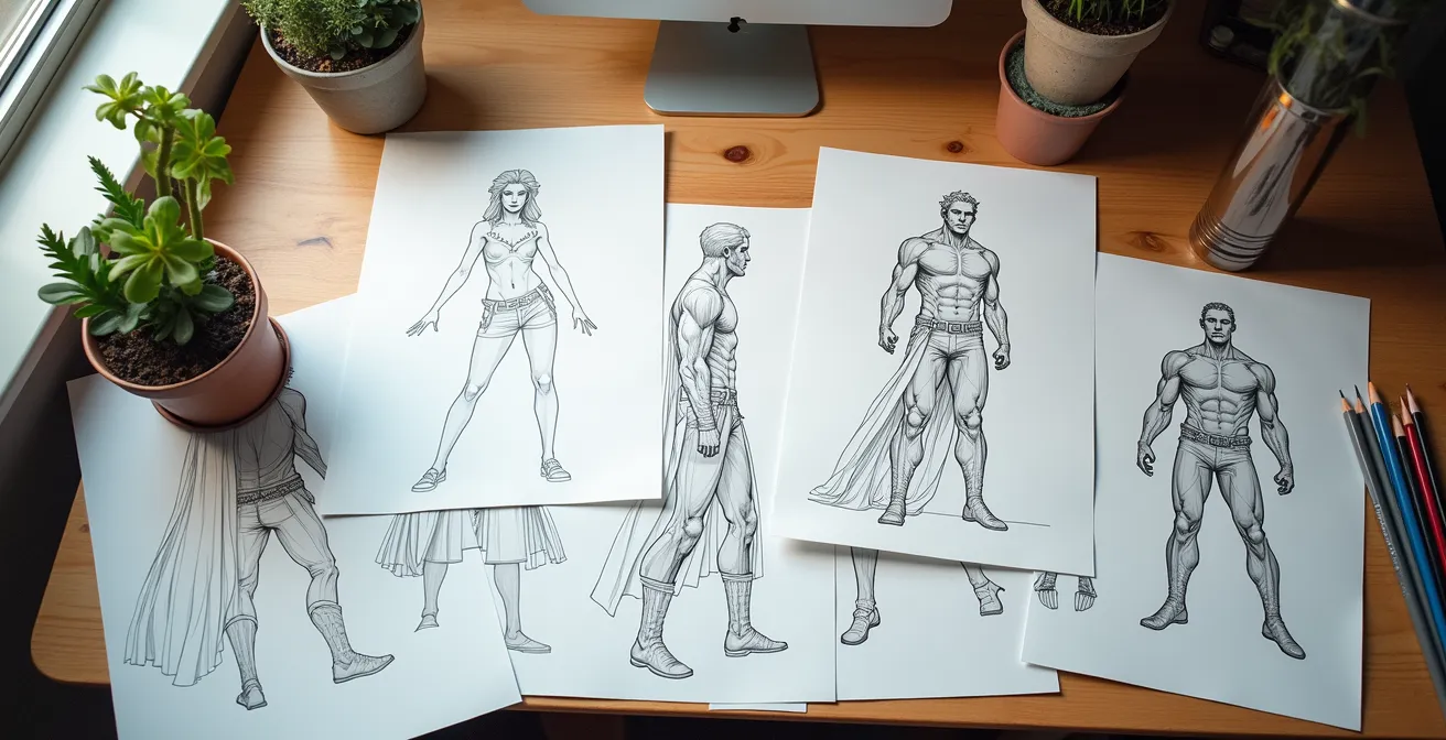
- Comprehensive Model Sheets: Character turnarounds are essential, showing the character from the front, side, back, and 3/4 views to establish their proportions from all angles.
- Proportion & Measurement Guides: Use a “head count” or other relational measurements to define the character’s proportions. How many heads tall are they? How does the length of their arm relate to their torso?
- Core Shapes and Silhouettes: Deconstruct the character into their most basic geometric shapes. This is the key to rebuilding them consistently in any pose.
- Color and Line Rules: Document the exact color codes (HEX, CMYK) for every element of their design. Define your line weight rules—for example, a thicker outline with thinner interior lines.
- Signature Poses and Expressions: This is where you codify their “emotional thumbprint.” Include sketches of the character expressing core emotions (joy, anger, fear) and holding their signature postures.
This document is your preparation. It’s the work you do upfront that grants you the freedom to draw with confidence and consistency for the entire 20, 50, or 100 pages of your story.
Your next step is to stop drawing and start planning. Open a new document and draft the first page of your own Style Bible. Define your character’s core shapes, choose one signature color, and write down three rules for how they express anger. This is the first step to turning inconsistency from a frustration into your greatest storytelling asset.