The frustrating buckling of watercolor paper isn’t a flaw to be fought, but a natural property to be understood. The key to achieving perfectly flat washes is not to use less water, but to master the paper’s ‘breath’—its cycle of expansion when wet and contraction when dry. By choosing the right paper and controlling its environment and saturation, you can transform this challenge into a predictable part of your creative flow, ensuring your colors merge beautifully without warping.
There is a unique moment of quiet despair every watercolor artist knows. You’ve laid down a luminous, flowing wash of color, watching it bloom across the paper. It’s perfect. But as it begins to dry, a hill rises from the surface. A dreaded buckle forms, creating a puddle where pigment settles into a dark, unwanted line, ruining the delicate gradient. The initial joy gives way to frustration, a feeling that you are fighting your own materials. The common advice is to simply use heavier paper or to undertake the cumbersome process of stretching, but these are merely tactics, not a true understanding.
These solutions treat the symptom, not the cause. They don’t explain the intimate dance between cellulose fiber and water. The true path to controlling the unpredictable nature of this medium lies not in brute force, but in a gentle partnership. It’s about understanding the very breath of the paper—how it inhales water and exhales as it dries. When you learn to work with this natural rhythm, buckling ceases to be an obstacle and becomes a manageable part of the process. This shift in perspective is the foundation for creating the soft, seamless gradients you envision.
For those who prefer a visual guide, the following video demonstrates a practical method for flattening a painting after it has buckled. While our focus here is on prevention, this is a valuable technique for rescuing a piece you love.
This article will guide you through that deeper understanding. We will explore the science behind the paper itself, the environmental factors that influence it, and the techniques that honor its properties, transforming your relationship with the medium from a battle to a graceful collaboration.
Summary: How to Prevent Your Watercolor Paper From Buckling When Wet
- Why Does 300gsm Paper Hold a Wash Better Than Sketchbook Paper?
- How to Drop Color Into Wet Paper to Create Soft Gradients?
- Pans or Tubes: Which Format is More Economical for Large Washes?
- The “Overworking” Mistake: Why Touching Drying Paint Destroys Transparency?
- When to Remove Masking Fluid to Avoid Tearing the Surface?
- Why Does Dry Air Make Your Action Drop and Strings Buzz?
- Hiking Boots or Sneakers: Which Will Save Your Feet in the Mud?
- How to Prime a Canvas to Prevent Oil Paint From Rotting the Fabric?
Why Does 300gsm Paper Hold a Wash Better Than Sketchbook Paper?
The most common advice given to frustrated beginners is to “use heavier paper,” but the reason is more profound than simple thickness. Think of paper fibers as breathing. When water is applied, the cellulose fibers swell and expand—they “inhale.” As the paper dries, they contract—they “exhale.” Buckling is simply an uneven breath. Lighter paper, like that found in a typical sketchbook (around 90lb or 185gsm), has shorter fibers and less internal structure. It inhales erratically, causing hills and valleys.
In contrast, professional-grade 140lb (300gsm) paper is the standard for a reason. According to research on paper fiber composition, 100% cotton papers use significantly longer fibers. These long, interwoven fibers provide exceptional strength and a more uniform structure. This allows the paper to absorb water more evenly and expand in a controlled, predictable manner. The “inhale” is deeper and more consistent across the entire sheet, dramatically reducing the tendency to warp.
While 300gsm paper is the versatile workhorse, even heavier papers like 300lb (640gsm) exist. These are so thick and stable that they barely seem to breathe at all, often eliminating the need for stretching even with the wettest techniques. Choosing the right paper is your first step in turning the fight against buckling into a partnership with your materials. It’s about giving the water a surface that can handle its presence gracefully.
How to Drop Color Into Wet Paper to Create Soft Gradients?
Creating those ethereal, soft-focus gradients is the heart of watercolor. This technique, known as wet-on-wet, relies on a principle of “controlled surrender.” You aren’t forcing the pigment; you are guiding its journey on a prepared surface. The key is achieving the perfect saturation level on your paper—not too dry, not a puddle, but a uniform, glossy sheen where the fibers have fully “inhaled” the water.
The most reliable way to achieve this perfect surface is through stretching. A case study on professional paper preparation for gradient techniques outlines this process clearly. It involves completely submerging your paper in cool water for a few minutes (typically 3-5 minutes for 300gsm paper), allowing the fibers to expand fully. You then secure the wet paper to a rigid board with staples or gummed tape. As it dries, it pulls taut, creating a perfectly flat, drum-tight surface. This pre-expanded state means the paper has no room to buckle when you re-wet it for painting.
Once your paper is stretched and ready (or if you are using a heavy block that resists buckling), you apply a clean, even wash of water. When it reaches that perfect glossy stage, you gently touch your pigment-loaded brush to the surface. The color will bloom outward, carried by the water in organic, beautiful patterns. This is where the magic happens.
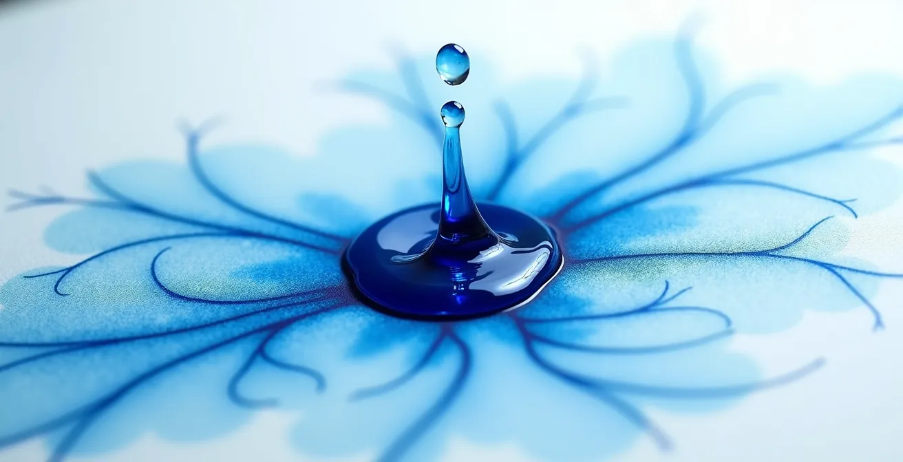
As you can see in the dispersion of pigment on a wet surface, the color follows the water’s path. By preparing your paper to accept the water without resistance, you are setting the stage for these breathtaking effects. It’s a process of patience and preparation that allows for ultimate creative freedom during the painting phase.
Pans or Tubes: Which Format is More Economical for Large Washes?
When covering a large area, such as a sky or a watery background, both your paint format and paper choice are critical. While pan paints are excellent for portability and smaller details, tube paints are generally more economical and efficient for extensive washes. The reason lies in your ability to control the water-to-pigment ratio before it ever touches the paper. With tubes, you can squeeze out a generous amount of pigment and pre-mix a large, consistent puddle of color. This ensures a uniform hue and a controlled amount of water, reducing the risk of oversaturating one area of the paper.
This control is crucial for preventing buckling. Inconsistent water application is a primary cause of warping. Repeatedly re-wetting a small pan to mix enough color for a large wash can lead to adding too much water to your brush and, consequently, to the paper. A single, well-mixed puddle from tube paint provides a more reliable application. The foundational importance of a robust paper surface cannot be overstated here; industry surveys indicate that 140lb (300gsm) paper is used by 80% of professional watercolorists, precisely because it can withstand the generous washes required for these techniques.
The following table breaks down the key differences, illustrating why tubes are often the superior choice when your goal is a smooth, flat wash over a large surface.
| Factor | Pan Paints | Tube Paints |
|---|---|---|
| Water Control | Variable – water added during rewetting | Precise – premixed ratios possible |
| Large Wash Efficiency | Multiple rewettings needed | Single large puddle preparation |
| Paper Saturation Risk | Higher – inconsistent water amounts | Lower – controlled water volume |
| Cost per Coverage | Less economical for large areas | More economical for extensive washes |
Ultimately, choosing tube paints for your large washes is another step toward partnership with your medium. It’s about setting yourself up for success by controlling variables before you begin, allowing for a more fluid and less frustrating painting experience.
The “Overworking” Mistake: Why Touching Drying Paint Destroys Transparency?
Overworking a watercolor painting is a mistake born from anxiety. It happens when you can’t resist the urge to “fix” something while the paper is in that delicate, damp, half-dry state. The fibers are in the middle of their “exhale,” contracting as they dry. When you scrub or dab at the surface during this phase, you are disturbing this process. You lift the initial layer of pigment, rough up the paper fibers, and push the unsettled pigment deep into the paper’s texture. The result is a muddy, opaque patch that has lost all of its watercolor luminosity.
The key to preserving transparency is to let the paper complete its drying cycle undisturbed. This requires patience and a shift in mindset. You must trust the process and your initial brushstrokes. When you feel the urge to meddle, the best action is often no action at all. Stepping away from the painting can be the most productive thing you do. Once the paper is completely, bone-dry, you have options for gentle correction. But touching it while it’s damp is almost always destructive.
Learning to avoid this pitfall is crucial for any watercolorist. Instead of reacting with frustration, you can adopt a proactive approach with a clear set of strategies to maintain control and protect your work’s transparency.
Your Gentle Plan to Avoid Overworking
- Plan Ahead: Draw a preliminary sketch or a small thumbnail of your composition. Knowing your plan reduces the likelihood of making mistakes you’ll feel compelled to fix.
- Walk Away: When frustration builds and you feel the urge to “fix” a damp area, physically step away from your painting for a few minutes. Let it dry and approach it with fresh eyes.
- Lift When Dry: For corrections, wait until the paper is completely dry. Then, you can gently lift color using a damp (not wet) Mr. Clean Magic Eraser or a stiff, thirsty brush.
- Address Tears from Behind: If you accidentally tear the paper surface, do not continue working the damaged area. Allow it to dry fully, then apply a small piece of tape to the back of the paper to stabilize the tear.
Embracing these habits turns anxiety into intention. You move from being a reactive fixer to a patient creator, safeguarding the delicate beauty and transparency that makes watercolor so unique.
When to Remove Masking Fluid to Avoid Tearing the Surface?
Masking fluid is a magical tool for preserving crisp white highlights, but it can quickly turn into a nightmare if removed improperly, tearing the delicate surface of your paper. The secret to safe removal lies, once again, in understanding the paper’s breath. When you apply masking fluid and then paint over it, you create areas of differential drying. As a professional guide on flattening buckled paintings explains, the painted areas get wet, causing the fibers to expand, while the masked-off areas remain dry. This creates tension in the paper.
If you try to remove the masking fluid while the paper is still even slightly damp, the fibers in the painted area have not fully contracted back to their original state. The masking fluid, which has a strong bond, will pull at these still-swollen and weakened fibers, causing them to shred and tear away. The only safe time to remove masking fluid is when the paper is 100% bone-dry to the touch. At this point, the fibers have completed their “exhale,” contracted fully, and regained their maximum strength, allowing the masking fluid to be peeled or rubbed off without damaging the surface.
The quality of your paper is also a major factor. As material specifications demonstrate, 100% cotton paper with robust internal and external sizing is far more resilient. Sizing is a substance added during manufacturing that controls water absorption and binds the fibers together. Good sizing creates a tougher surface that is much less likely to tear, even with techniques as demanding as masking. Patience is your greatest ally here; waiting that extra hour for the paper to be completely dry is always worth it to protect your hard work.
Why Does Dry Air Make Your Action Drop and Strings Buzz?
In the world of luthiery, a sudden change in humidity is the enemy. When the air becomes too dry, the wood of a guitar shrinks, causing the instrument’s action to lower and the strings to buzz against the frets. This same principle applies directly to your watercolor paper. Paper is, at its core, a wood product, and it is just as susceptible to the ambient environment. Dry air sucks the moisture out of the paper fibers, making them brittle and dimensionally unstable.
Painting on paper that is too dry can lead to unpredictable results. The water from your brush is absorbed too quickly and unevenly, preventing pigments from flowing and blending smoothly. Furthermore, a dramatic shift from a dry studio environment to a sudden, heavy wash of water can shock the paper, exacerbating buckling as the fibers expand rapidly and erratically. Controlling your studio’s climate is a subtle but powerful way to prevent these issues.
You don’t need a professional laboratory, but being mindful of your environment makes a significant difference. A simple hygrometer can tell you the relative humidity in your room. The ideal is to maintain a stable environment. According to environmental monitoring studies, a 45-55% humidity range is optimal for preventing paper from becoming too dry and brittle or too damp and floppy. In a very dry climate, a small humidifier can be one of the best investments for your art practice, ensuring your paper is in a stable, receptive state before you even begin to paint.
Hiking Boots or Sneakers: Which Will Save Your Feet in the Mud?
The question seems absurd in an art context, but the logic is perfectly transferable. You wouldn’t wear light sneakers for a trek through a muddy swamp; you’d choose sturdy, waterproof hiking boots. Choosing your watercolor paper follows the exact same principle. Your technique is the “terrain,” and your paper is the “footwear.” Using a thin, student-grade paper for a heavy, wet-on-wet technique is like wearing sneakers in the mud—it simply isn’t equipped for the conditions and is guaranteed to fail.
The “sturdiness” of your paper comes from two main factors: its weight (gsm) and its sizing. As Rileystreet Art Supply’s guide notes, “Sizing dramatically increases the stability of the paper. It helps keep the fibers together so the paper remains stable when water is applied.” This internal and external sizing acts like the waterproof membrane of a hiking boot, controlling how quickly water is absorbed and giving the paper the integrity to stand up to wet conditions. Heavier paper has more fiber and sizing, making it the “hiking boot” of the watercolor world.
This analogy provides a simple, intuitive guide for selecting the right paper for your project. By matching your paper to the demands of your painting style, you avoid the frustration of your materials failing you mid-process.
| Painting ‘Terrain’ | Paper Choice | Weight Required | Stretching Needed |
|---|---|---|---|
| Light sketch (dry path) | Student paper | 90lb/185gsm | No |
| Standard painting (trail) | Professional grade | 140lb/300gsm | Recommended |
| Heavy wet-on-wet (swamp) | Heavy professional | 300lb/640gsm | Optional |
| Multi-layer work (mountain) | Premium cotton | 300lb+/640gsm+ | No |
Thinking this way empowers you to make conscious choices. Before you start, ask yourself: what “terrain” am I about to enter? Am I going for a light walk or a deep swamp expedition? Your answer will tell you exactly which paper to choose, ensuring a successful journey.
Key Takeaways
- Understand that paper ‘breathes’—it expands when wet and contracts when dry. Controlling this cycle is the key to preventing buckling.
- Your studio environment matters. Maintaining a stable humidity (45-55%) prevents paper from becoming brittle and prone to warping.
- Match your paper’s weight and quality to your technique, just as you would choose footwear for different terrains. Heavier work requires sturdier paper.
How to Prime a Canvas to Prevent Oil Paint From Rotting the Fabric?
In oil painting, an artist must first prime their canvas with gesso. This acrylic layer creates an impermeable barrier, preventing the acidic oils in the paint from coming into direct contact with the fabric and causing it to rot over time. Watercolor has its own version of this “invisible primer,” and understanding it is the final piece of the puzzle in mastering your paper: sizing.
As a comparison between mediums shows, the vegan gelatin sizing in modern watercolor paper acts as its equivalent to gesso. However, instead of creating a complete seal, it creates a semi-permeable barrier. This is the genius of watercolor paper design. The sizing controls how quickly the water and pigment are absorbed into the paper’s core. Without sizing, water would blot instantly, preventing any flow or blending. With too much sizing, the paint would sit on the surface and never adhere. The right amount of sizing allows the paint to remain workable on the surface long enough for you to create your effects, before it is gently absorbed into the fibers as it dries.
This “priming” is what gives you control. It’s what allows for the lifting of color, the smooth blending of washes, and the resilience against techniques like masking. When you choose a high-quality, 100% cotton paper with excellent internal and external sizing, you are choosing a surface that has been perfectly primed for a partnership with water. You are trusting the manufacturer’s craft so that you can focus on your own.
The entire journey, from preventing buckling to creating soft gradients, comes back to this core idea. It’s not about fighting the water. It’s about choosing a surface designed to dance with it, understanding its rhythms, and guiding it with a patient hand. This is how you transform frustration into flow.
By embracing these principles, you can begin to work in harmony with your materials. The next logical step is to consciously apply this knowledge to your next painting, starting with a mindful selection of your paper and an assessment of your environment.