Translating music into art isn’t about capturing fleeting emotions; it’s about building a deliberate system of sensory translation.
- Establish a ‘visual grammar’ that systematically links specific sounds (timbre, rhythm, frequency) to visual elements (shape, texture, color).
- Map audio textures like distortion, warmth, or digital glitching to specific media and techniques, such as impasto for fuzz or pixelation for bitcrushing.
Recommendation: Start by creating a personal color-to-key dictionary as your foundational tool, documenting your unique sensory responses rather than relying on generic associations.
For a visual artist, the desire to paint what you hear is a primal, potent impulse. You put on a piece of music, and the sound fills the room, evoking shapes, colors, and movements. Yet, when you try to capture this cascade on canvas or screen, the result is often a form of emotional chaos—a beautiful mess that feels inspired but lacks the profound structure of the music itself. The common advice to “paint your feelings” or study Kandinsky’s theories offers a starting point, but it rarely provides a bridge over the chasm between auditory input and intentional visual output.
The secret lies in shifting your perspective. Instead of viewing synesthesia as a mystical gift of passive inspiration, consider it an active process of sensory translation. The true breakthrough occurs when you stop trying to simply *reflect* the music and start building a systematic, personal ‘visual grammar’ to *interpret* it. This isn’t about suppressing emotion; it’s about giving it structure, translating the precise architecture of sound—its timbre, harmony, rhythm, and texture—into an equally deliberate visual language. It’s the difference between a random splash of paint and a calculated brushstroke that carries specific sonic weight.
This guide will deconstruct that process. We will explore concrete methodologies for mapping sonic properties to visual elements, moving beyond abstract feelings to create a coherent system. We will analyze how to choose the right medium for a specific audio texture, how to use composition to represent sonic space, and how to avoid the common pitfall of overwhelming the viewer with sensory noise. This is your path from being a passive receiver of musical inspiration to becoming an active translator of its very essence.
To navigate this exploration of sensory translation, the following guide breaks down the core techniques and conceptual shifts required. Each section tackles a specific question, providing a structured path from foundational theory to practical application, helping you build your own unique visual lexicon for sound.
Summary: A Systematic Approach to Visualizing Sound
- Why Do We Judge an Album’s Sound by Its Cover Art?
- How to Map Video Projections onto 3D Sculptures for Stage Design?
- Pixel or Paint: Which Medium Best Captures the Texture of Distortion?
- The “Chaos” Mistake: Why Too Many Stimuli Confuse the Audience?
- When to Use Warm Colors to Represent Minor Key Sadness?
- How to Align Your Instagram Grid to Tell a Single Mythological Story?
- How to Design Stage Visuals That Look Good on Livestreams?
- How to Use the Rule of Thirds to Create Tension in Landscapes?
Why Do We Judge an Album’s Sound by Its Cover Art?
We judge an album by its cover because cover art is the first act of sensory translation a listener encounters. It’s a synesthetic promise. Before a single note is heard, the artwork establishes a visual frequency that primes our sonic expectations. It functions as a gateway, suggesting genre, mood, and texture through a purely visual language. This phenomenon goes beyond simple marketing; it’s a fundamental aspect of how we process cross-modal information. The brain seeks patterns and connections, and a compelling cover provides the initial key to the audio-visual cipher.
A masterful example is the iconic cover of Joy Division’s “Unknown Pleasures.” What we see are 80 stark white lines on a black background. This image is not an abstract artistic interpretation; it is a data visualization of radio waves from the first discovered pulsar. This choice is a profound act of sensory translation. The cold, rhythmic, and mechanical nature of the data plot perfectly encapsulates the album’s sound: sparse, haunting, and relentlessly structured. As an early instance of synesthesia’s role in artistic expression, the cover doesn’t just suggest the music’s mood; it visually *is* the music’s underlying pulse. The viewer intuitively “hears” the starkness and repetition before pressing play.
This principle reveals that the most powerful synesthetic art isn’t arbitrary. It’s built on a coherent visual grammar where specific visual choices correspond to tangible sonic properties. The artist’s role is to create this grammar, to decide that a jagged line equals a distorted guitar, or a soft gradient equals a string pad. The cover art is the Rosetta Stone for this language, teaching the audience how to see the sound before they hear it.
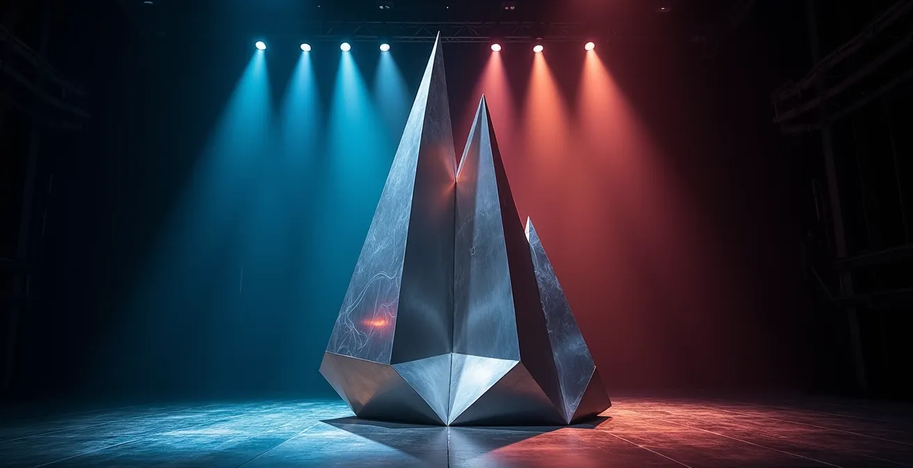
How to Map Video Projections onto 3D Sculptures for Stage Design?
Projection mapping onto three-dimensional objects is one of the most literal forms of translating sound into a spatial experience. It transforms a static sculpture into a dynamic body, animated by audio. The core challenge is not technical, but conceptual: deciding *how* the visuals will respond to the sound. The approach you choose defines the narrative and the audience’s visceral connection to the performance. Will the visuals be a direct, beat-for-beat reaction, or will they tell a slower, more thematic story that unfolds with the music?
The distinction lies in two primary methodologies: audio-reactive and narrative-reactive mapping. Audio-reactive visuals are directly tied to the raw data of the sound wave, such as frequency, beat, and amplitude. A kick drum might trigger a pulse of light, while a high-frequency synth lead causes frenetic patterns. This creates a tight, physical connection that the audience feels instantly. In contrast, narrative-reactive visuals are cued to the larger structure of the music—the verse, the chorus, the bridge. These transitions are more gradual and thematic, creating an emotional arc that complements the song’s story. For a multimedia artist, understanding which to use is key.
This table breaks down the core differences, helping you choose the right system for your artistic intent. This decision is central to your visual grammar; it determines whether you are translating the music’s momentary energy or its overarching soul.
| Aspect | Audio-Reactive | Narrative-Reactive |
|---|---|---|
| Response Trigger | Beat, frequency, amplitude | Song structure (verse/chorus) |
| Visual Behavior | Immediate, rhythmic pulsing | Gradual thematic transitions |
| Programming Complexity | Moderate (FFT analysis) | High (requires cue mapping) |
| Audience Impact | Visceral, physical response | Emotional, storytelling arc |
| Best For | EDM, techno, instrumental | Concept albums, theatrical shows |
Pixel or Paint: Which Medium Best Captures the Texture of Distortion?
The choice of medium is a critical component of your visual grammar. It’s not just about color and shape; it’s about textural equivalence. How do you visually represent the “feel” of a sound? A warm, saturated tape hiss has a fundamentally different texture than a cold, jagged digital clip. Choosing the right medium—be it physical paint or digital pixels—is an act of precise sensory translation. Oil paint, with its capacity for soft blending and warm glazing, might perfectly capture the feeling of analog saturation. In contrast, the hard-edged, aliased nature of low-resolution pixel art is the native language of bitcrushed audio.
The key is to deconstruct the audio distortion into its constituent sensory properties. Is it warm or cold? Smooth or rough? Organic or synthetic? Answering these questions guides your choice of medium and technique. For instance, the chaotic, thick texture of a fuzz pedal could be represented by a heavy impasto technique in painting, where the physical relief of the paint mirrors the sound’s aggressive body. This systematic approach transforms an abstract concept (“distortion”) into a tangible visual decision.
This has even been explored by machines. The SyNEThesia project, a neural network-based music visualizer, demonstrates how AI can be trained on datasets labeled ‘glitch’ and ‘decay’ to generate novel visual textures for distorted sounds. This proves that a systematic mapping between audio and visual texture can be established and learned. For the human artist, this mapping is more intuitive but should be just as deliberate.
The following table proposes a starting point for your own dictionary of textural equivalence, mapping common audio distortion types to visual media and techniques.
| Audio Distortion Type | Best Visual Medium | Visual Technique |
|---|---|---|
| Bitcrushing | Digital/Pixel Art | Low-res pixelation, color banding |
| Tape Saturation | Oil Paint | Warm color bleeding, soft edges |
| Fuzz/Overdrive | Mixed Media | Textured impasto, rough surfaces |
| Digital Clipping | Vector Graphics | Hard edges, flat color blocks |
| Analog Warmth | Watercolor | Gradient washes, organic flow |
The “Chaos” Mistake: Why Too Many Stimuli Confuse the Audience?
The most common pitfall in synesthetic art is the “chaos mistake”—the assumption that more visual stimuli equate to a more intense experience. When every drum hit, bass note, and synth pad triggers a new visual element, the result isn’t a rich tapestry; it’s an incoherent wall of noise. The audience experiences cognitive overload, and the core structure of the music is lost. This happens when an artist lacks a clear visual grammar and simply throws every sensory input onto the canvas. The antidote to chaos is not less stimuli, but a clearly defined visual hierarchy.
Just as a musical mix has a lead vocal, a rhythm section, and background textures, your visual composition must have a focal point. This is the concept of the visual anchor: a dominant element that corresponds to the music’s most important part. This anchor provides a stable center around which secondary and tertiary elements can move without creating confusion. For example, the lead melody might be represented by a single, brightly colored shape that moves fluidly, while the rhythm is translated into subtle, pulsating background patterns. This hierarchy guides the viewer’s eye and helps them “read” the visual composition in the same way they hear the musical arrangement.
Achieving this clarity requires discipline and the strategic use of “visual silence.” Just as musical rests create tension and release, moments of visual simplicity or even complete blackness can amplify the impact of what follows. It’s about controlling the flow of information, ensuring that each visual element has a clear purpose and relationship to the sonic whole. Without hierarchy and intentional silence, you are not translating the music; you are just shouting over it.
Action Plan: Auditing for Visual Clarity
- Points of Contact: List all musical elements you want to visualize (e.g., kick drum, bassline, lead vocal, synth pad, reverb tail).
- Visual Inventory: For each musical element, assign a distinct visual property (e.g., Kick = pulsing circle; Vocal = flowing line; Reverb = soft, expanding haze).
- Hierarchy Check: Rank your musical elements by importance in the mix. Does your visual design reflect this? The lead vocal’s visual element should be more prominent (brighter, larger, more central) than the hi-hat’s.
- The Silence Test: Identify moments of musical rest or quiet passages. Does your visual composition breathe in these moments? Introduce black frames or minimalist visuals to create this breathing space.
- Anchor Identification: Pinpoint your primary “visual anchor.” Is it consistently present and recognizable, providing a focal point for the viewer amidst the other changing elements?
When to Use Warm Colors to Represent Minor Key Sadness?
The association of “sadness” with the color blue is a cultural cliché, not a universal synesthetic law. For an artist building a personal visual grammar, relying on such defaults is a missed opportunity for nuance. Minor keys can evoke a vast spectrum of somber emotions, from melancholic nostalgia to violent grief, and your color choices should reflect this complexity. The idea that sadness must be “cold” is a limitation. Warm colors—ochres, deep oranges, muted reds—can powerfully represent specific facets of minor-key sadness in a way that is often more complex and emotionally resonant.
Consider the different “flavors” of sadness. The golden light of a late afternoon can evoke a deep sense of nostalgia and longing—a warm, minor-key feeling. A smoldering, dark red might perfectly capture the slow burn of angry grief. The key is to move beyond one-to-one emotional labels and build a personal, systematic color dictionary based on your own sensory responses. This process is about introspection and documentation, not about following pre-existing rules. Your synesthesia is your own; your color theory should be too.
To build this personal system, you must become a scientist of your own perception. Documenting your responses is the first step toward creating a consistent and authentic visual language. Kandinsky’s theories can be a framework, but your own experience is the ultimate authority. Here is a process for developing your unique synesthetic color dictionary:
- Document emotional responses: For 30 days, listen to a variety of musical pieces (especially in minor keys) and note the colors that spontaneously come to mind. Don’t judge, just record.
- Study foundational theories: Use Wassily Kandinsky’s ideas on the spiritual and psychological weight of colors as a starting point, but be prepared to deviate based on your own findings.
- Map nuances: Begin to map warm colors to specific, nuanced forms of sadness. For example, does a specific shade of orange represent nostalgia for you? Does a deep maroon equate to a feeling of solemnity?
- Test your mappings: Actively create small visual studies in response to minor key pieces using your new color dictionary. See if the resulting artwork feels authentic to your experience of the sound.
- Refine and contextualize: Your color associations will evolve. Be open to refining them and consider how cultural context might influence your perception, but always prioritize your personal, intuitive response.
How to Align Your Instagram Grid to Tell a Single Mythological Story?
Translating a musical narrative into a static format like an Instagram grid requires thinking like a composer of visual music. The nine-square grid is not nine separate images; it is a single canvas, a “visual libretto.” The key is to apply the concept of a leitmotif—a recurring musical theme associated with a particular person, idea, or situation. In your visual grammar, a leitmotif becomes a recurring visual element: a specific color palette, a unique shape, a repeating texture, or an abstract symbol.
Imagine you are translating a concept album about the myth of Icarus. The theme of “flight” could be represented by a recurring motif of upward-sweeping, feathered brushstrokes. The theme of the “sun” could be a persistent, glowing yellow-orange circle that grows in size and intensity across the grid. The “ocean” below could be a constant band of dark, textured blue at the bottom third of each image. When a user views your profile, their eye scans the grid, and these repeating visual leitmotifs create a narrative arc, telling the mythological story in parallel with the sonic journey of the album.
This method was pioneered in digital form by Stephen Malinowski with his Music Animation Machine. As described in a profile by The Marginalian, Malinowski’s work translates musical structure into visual sequences by assigning consistent shapes and colors to musical themes. These visual motifs appear, interact, and disappear just as their sonic counterparts do, creating a visual story that perfectly mirrors the music. This is not random visualization; it is a rigorous, rule-based translation. For your grid, this means establishing a clear visual language and applying it with compositional discipline across all nine posts.
To create your own visual leitmotifs for a narrative grid, follow these steps:
- Identify musical themes: Listen to your album or composition and isolate the key recurring melodic or rhythmic themes.
- Assign a visual language: Give each theme a unique visual signature. Theme A could be “sharp, red, triangular shapes,” while Theme B is “soft, blue, circular gradients.”
- Map the grid to narrative: Structure your 9-square grid to mirror the story’s progression. The top row could be the exposition, the middle the climax, and the bottom the resolution.
- Develop visual glyphs: Create simple, symbolic shapes for key sonic events, like a specific drum fill or a guitar solo, and embed them within the larger images.
- Embed consistently: Weave these visual motifs and glyphs throughout your nine posts. Their repetition and evolution will form a secret visual language that tells the story to the observant viewer.
How to Design Stage Visuals That Look Good on Livestreams?
Designing visuals for a hybrid audience—those in the room and those watching on a screen—requires a dual visual grammar. What reads as breathtakingly detailed and subtle in person can become a muddy, flickering mess when passed through the filter of a camera sensor and video compression algorithms. The key is to design in layers, creating bold, high-contrast elements for the livestream audience while preserving intricate details for the in-person viewers.
The primary enemy of livestream quality is visual noise. High-frequency patterns, such as fine static or rapidly strobing thin lines, are notoriously difficult for compression codecs to handle. They often result in ugly digital artifacts and a distracting flicker. Similarly, subtle color gradients that look beautiful on a large projection screen can be crushed into harsh bands of color on a compressed video stream. Therefore, the visual language for the livestream must be built on bold shapes, slower movements, and a high-contrast, saturated color palette. Think of it as designing for a low-resolution medium, even if you’re broadcasting in 4K.
This doesn’t mean sacrificing complexity for the live audience. The solution is a dual-layer approach. You can have a foreground layer of visuals composed of bold, “camera-friendly” elements that carry the main narrative. Behind this, a background layer can contain the more intricate, textural details that are primarily appreciated by the audience in the physical space. This ensures the experience is optimized for both contexts without compromising either one. The following table outlines key strategic considerations for designing for this dual audience.
| Visual Element | For Livestream Viewers | For In-Person Audience |
|---|---|---|
| Color Palette | High contrast, saturated colors | Can include subtle gradients |
| Pattern Frequency | Avoid high-frequency patterns | Complex textures acceptable |
| Movement Speed | Slower transitions (avoid flicker) | Rapid changes possible |
| Detail Level | Bold, clear foreground elements | Intricate background details |
| Interactive Elements | Comment velocity modulation | Physical space interaction |
Key takeaways
- The most effective synesthetic art is built on a personal ‘visual grammar’—a systematic mapping of sound to sight, not just random emotional impulses.
- Translate the specific texture of sound (like distortion or warmth) by choosing an equivalent visual medium (like pixel art for digital glitches or watercolor for analog warmth).
- Avoid the “chaos mistake” by establishing a clear visual hierarchy with a ‘visual anchor’ and using strategic ‘visual silence’ to guide the viewer’s attention.
How to Use the Rule of Thirds to Create Tension in Landscapes?
While the Rule of Thirds is a classic compositional tool for landscape photography, its true power in sensory translation is in mapping the *spatial structure* of sound onto a visual field. Instead of just placing a horizon on a third-line, you can use the grid to represent the stereo field of the music. This transforms the canvas from a simple picture plane into a visual representation of the audio mix, creating a dynamic tension that mirrors the sonic experience.
This technique is used intuitively by developers of audio visualizers. As detailed in a breakdown of synesthesia in visualizers, a common method is to map the stereo pan directly onto the screen’s horizontal axis. Sounds panned hard left appear on the left vertical third of the screen, center-panned elements like the lead vocal or kick drum occupy the middle, and sounds panned to the right appear on the right third. This creates an immediate, intuitive spatial representation of the mix. The viewer doesn’t just hear the separation; they *see* it. This creates a more immersive and comprehensible experience, as the visual composition directly reflects the architectural choices made in the sound engineering.
For the artist, this opens up a new dimension of compositional grammar. You can use this principle to create visual tension and balance that directly corresponds to the music. Placing the visual element for the lead instrument slightly off-center creates dynamism. Leaving one of the vertical thirds deliberately empty during a quiet passage can represent silence or build anticipation. The intersection points of the thirds grid become power centers, ideal locations for placing visual representations of musical climaxes or crescendos. Your composition becomes a stage for the sounds to perform on.
Here is how you can apply the Rule of Thirds as a tool for soundscape visualization:
- Represent the lead instrument off-center: Place the main visual element along one of the vertical third lines, not in the dead center, to create dynamic tension.
- Use horizontal thirds for frequency: A powerful convention is to map frequency ranges spatially: bass and low-frequency elements occupy the bottom third, mid-range instruments the middle, and high-frequency sounds the top third.
- Represent silence with negative space: Deliberately leave one of the nine sections of the grid empty to visually represent a musical rest or to build anticipation for an upcoming element.
- Place climaxes at intersections: Position the visual representations of musical peaks and crescendos at the four intersection points of the grid for maximum visual impact.
- Create flow between thirds: Animate your visual elements to move between the different thirds of the canvas as the music’s structure and panning evolve, creating a visual dance that follows the audio.
By applying these rules, the Rule of Thirds transcends its role as a simple compositional guideline and becomes a sophisticated tool for translating the very architecture of sound. Now that you have the foundational systems for translating sound, the next logical step is to begin building your own personal library of sensory correspondences.
Start your journey of sensory translation today. Pick one song. Choose one rule from your new visual grammar—perhaps mapping the bassline to a specific shape and the melody to a specific color. Create one small study. This act of deliberate, systematic creation is the first step toward moving beyond mere inspiration and truly beginning to paint what you hear.