Mastering composition isn’t about memorizing rules like the ‘rule of thirds.’ The true path to creating tension and emotion lies in understanding the universal principles of visual grammar—the psychological use of light, space, and focus. This understanding allows an artist to move beyond technically correct snapshots to create intentionally compelling works, whether in photography, drawing, or even musical performance.
Your images are technically perfect. The focus is sharp, the exposure is balanced, and you’ve diligently placed your subject along a rule of thirds gridline. Yet, they feel… quiet. Stable. Perhaps even a little boring. This is the plateau many photographers reach: the mastery of rules without the understanding of spirit. You’ve learned the ‘what’ of composition, but the ‘why’ remains elusive. The common advice is to simply practice more, but practicing the same safe patterns only reinforces them.
The conversation often stops at photography, discussing lenses and sensors. But the principles of tension are universal. They exist in the quick, gestural lines of a life drawing and in the stage presence of a musician connecting with an audience. The key isn’t to find another photography rule, but to grasp the deeper, cross-disciplinary language of composition. What if the secret to a more dynamic landscape photo lies in a technique used by actors? What if understanding portrait drawing could revolutionize how you frame a mountain range?
This guide moves beyond the prescriptive rule of thirds. We will explore a more holistic philosophy of composition, treating it as a form of visual grammar. We will deconstruct how light creates emotion, how depth of field tells a story, and how the empty space in an image can be more powerful than the subject itself. By connecting the dots between photography, drawing, and performance, you will learn not just how to compose a shot, but how to orchestrate an emotion and intentionally create the beautiful tension that separates a snapshot from a piece of art.
For those who prefer a visual format, the following video offers an immersive journey into the landscapes that inspire this very kind of artistic exploration, perfectly complementing the technical advice in this guide.
To navigate this exploration of artistic principles, the following summary outlines our key topics. Each section delves into a specific technique or concept, building a comprehensive understanding of how to create deliberate and impactful compositions.
Summary: From Technical Rules to Artistic Grammar
- Why Does “Golden Hour” Light Create Nostalgia?
- How to Capture Silk-Like Water Motion Without Overexposing the Sky?
- Film or Digital: Which Discipline Teaches You to Be More Selective?
- The “HDR” Mistake: Why “Crunchy” Photos Look Amateurish?
- When to Use f/16 Instead of f/2.8 for Maximum Storytelling?
- How to Use Acting Techniques to Sell a Song You Don’t Feel?
- Why Does Drawing the Space Between the Arms Help You Get Proportions Right?
- How to Capture the Gesture of a Pose in Under 30 Seconds?
Why Does “Golden Hour” Light Create Nostalgia?
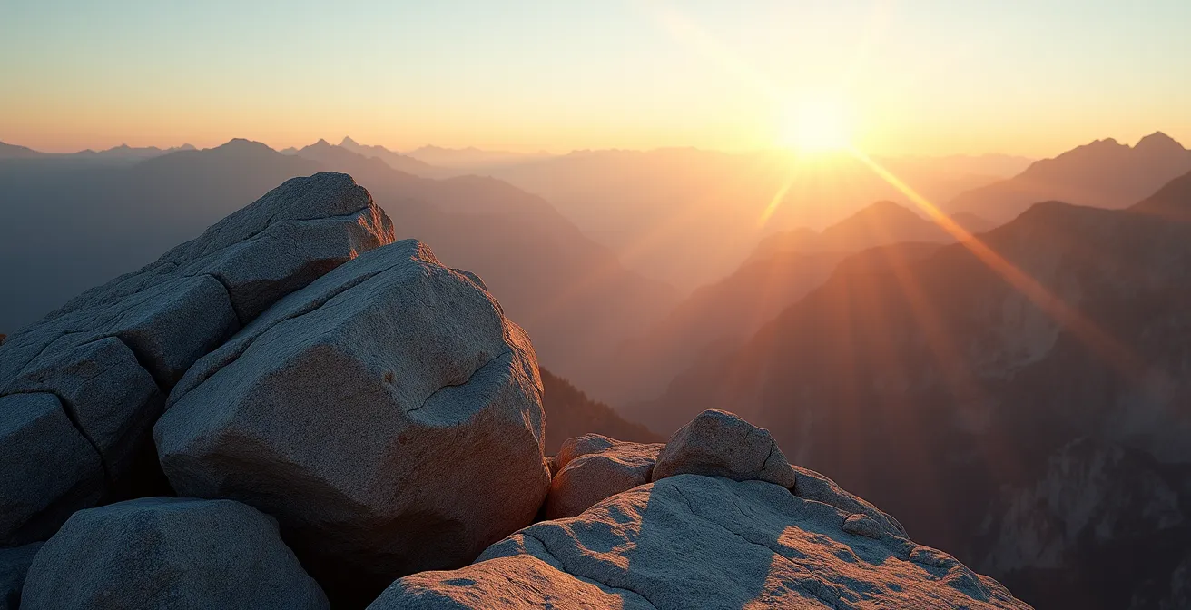
The warm, soft glow of the “golden hour” does more than just flatter subjects; it taps into a deep-seated psychological association with memory and the passage of time. This specific quality of light occurs when the sun is very low in the sky, and its rays travel through more of the Earth’s atmosphere. This journey scatters the shorter, cooler blue wavelengths, allowing the longer, warmer red and yellow wavelengths to dominate. Scientifically, golden hour lighting occurs when the sun is between 6 degrees below and 6 degrees above the horizon.
This warm palette mimics the tones of candlelight and fire, light sources tied to millennia of human storytelling and community. Furthermore, the long shadows created during this time add a sense of drama and three-dimensionality to a scene. They obscure details, forcing the viewer’s mind to fill in the gaps, much like a fading memory. The softness of the light diffuses hard edges, creating a dreamlike quality. This isn’t just a “pretty” light; it’s a powerful tool of narrative lighting.
To harness this, a photographer must think like a painter. It’s not about just being there at the right time, but about orchestrating the scene. By placing a subject against the light (backlighting), you can create a radiant halo effect that feels ethereal. Including foreground elements as silhouettes transforms them into abstract shapes, enhancing the sense of mystery and inviting the viewer into a moment that feels both immediate and remembered. This is where the artist moves beyond capturing a sunset and begins to craft an atmosphere of nostalgia. The light itself becomes a primary character in the story.
How to Capture Silk-Like Water Motion Without Overexposing the Sky?
Creating that ethereal, silky effect on water while keeping a bright sky properly exposed is a classic landscape photographer’s challenge. It’s a balancing act that demonstrates a true mastery of exposure. The “silky” texture is achieved with a long shutter speed, which blurs the water’s movement into soft streaks. However, this same long exposure will invariably blow out the highlights in a much brighter sky, turning it into a flat, detail-less white expanse. The solution lies not in software, but in controlling light before it ever hits the sensor.
The essential tool for this task is a Neutral Density (ND) filter. Think of it as sunglasses for your lens. It reduces the total amount of light entering the camera, allowing you to use a much longer shutter speed than would otherwise be possible without overexposing the entire scene. This is a deliberate act of creating intentional dissonance in exposure times—slowing down one part of reality (the water) while keeping another (the sky) correctly rendered.

Choosing the right ND filter is critical. They come in various strengths, measured in “stops” of light reduction. A 3-stop ND filter might be enough for an overcast day, while a 10-stop filter is often necessary for achieving multi-second exposures in broad daylight. The goal is to find the filter density that allows your shutter speed to be long enough to create the desired water motion (typically 1 to 10 seconds) while your aperture remains in the sweet spot for sharpness (like f/8 or f/11). This physical manipulation of light is a far more elegant and high-quality solution than trying to merge two different exposures in post-processing.
This table illustrates how different ND filters dramatically increase exposure time, enabling the capture of motion blur even in bright conditions. As you can see, a 10-stop filter can turn a fraction of a second into a long, creative exposure, as demonstrated by an analysis of long-exposure techniques.
| ND Filter | Light Reduction (Stops) | Base Exposure | New Exposure |
|---|---|---|---|
| ND8 | 3 stops | 1/125s | 1/15s |
| ND64 | 6 stops | 1/125s | 1/2s |
| ND1000 | 10 stops | 1/125s | 8s |
Film or Digital: Which Discipline Teaches You to Be More Selective?
In the debate between film and digital, the conversation often centers on aesthetics—grain, color science, and dynamic range. However, the most profound difference is psychological. Digital photography, with its near-infinite capacity and instant feedback, encourages a “spray and pray” approach. Film, with its tangible cost per frame and delayed gratification, forces a discipline of selectivity and pre-visualization. It’s not that one medium is inherently superior, but that film imposes constraints that are an incredibly effective teacher of compositional intent.
When each press of the shutter has a real-world cost, your entire process changes. You slow down. You walk around the scene, analyzing the light and geometry before ever lifting the camera to your eye. You ask yourself, “Is this the shot? Is this the absolute best version of this moment?” This forced deliberation is the antidote to creating hundreds of technically adequate but soulless images. It builds the mental muscle of seeing the final image in your mind’s eye before it is ever captured, a skill that is invaluable even when you return to digital.
The One Roll Challenge
A common exercise for digital photographers is to simulate the film experience. By limiting themselves to just 36 exposures for an entire outing and disabling the LCD review screen, they are forced into a new mindset. As one study on landscape techniques notes, professionals using this method report focusing more deliberately on composition, moving from simple sky-focused shots to more mindful integration of foreground elements and subtle compositional choices like balance and framing. This constraint forces them to engage with the visual grammar of the scene more deeply.
This discipline is not about masochism; it’s about shifting from being a data collector to a curator. The delay in seeing your results also teaches you to trust your technical skills and your artistic vision. You learn to meter light with precision and to compose with confidence, knowing you can’t just fix it later or check the screen. This learned selectivity is a portable skill that makes you a stronger, more intentional artist, regardless of the medium you ultimately choose.
Your 5-Step Compositional Audit: Moving from Safe to Strong
- Points of Contact: Review your last 10 photos. Where does the viewer’s eye land first? Is it always the center or a predictable rule-of-thirds point?
- Collecte: Inventory your go-to techniques. Do you always use a wide aperture? Always shoot at eye-level? Make an honest list of your compositional habits.
- Coherence: Does your composition serve the story? Confront your technical choices (e.g., f/16 vs f/2.8) with the specific emotion you wanted to convey.
- Mémorabilité/Émotion: Identify one image that feels “safe” and one that feels “tense.” What geometric element (or lack thereof) creates this feeling—symmetry, asymmetry, negative space?
- Plan d’intégration: Pick one principle from this article (e.g., using negative space, creating intentional dissonance) and plan your next shoot specifically to practice it.
The “HDR” Mistake: Why “Crunchy” Photos Look Amateurish?
High Dynamic Range (HDR) photography was born from a noble goal: to capture a scene’s full range of light, from the deepest shadows to the brightest highlights, mimicking what the human eye can see. However, in its common application, it has become synonymous with an over-processed, “crunchy” look that screams amateur. This happens when the goal shifts from naturalism to simply “recovering” all data, resulting in flat, unrealistic images with no sense of depth or authentic light.
The cardinal sin of bad HDR is the aggressive manipulation of highlight and shadow sliders. The tell-tale sign is a photo where there are no true blacks and no true whites—just a muddy mid-tone grey. Skies look bruised and menacing, textures appear hyper-sharpened, and halos of light appear around dark objects. This approach fundamentally misunderstands the role of light and shadow in composition. Shadows are not a problem to be eliminated; they are a critical tool for creating mood, depth, and directing the viewer’s eye. A composition without shadow is like a sentence without punctuation.
A common but misguided piece of advice, often seen in beginner tutorials, perfectly encapsulates this flawed approach. As one analysis of processing mistakes points out, the mantra of “bring down the highlights (-100), bring up the shadows (+100)” is the fastest way to destroy a photo’s naturalism. As an anonymous YouTube editor once famously advised his followers:
bring down the highlights (-100), bring up the shadows (+100)
– Anonymous YouTube Editor, Common HDR Processing Mistake
A sophisticated artist uses HDR subtly, as a tool for gentle compression of dynamic range, not its obliteration. The goal is a believable image that still feels like it was lit by a single, natural source. This often means embracing shadows, letting some highlights clip to pure white if they are specular (like the reflection of the sun on water), and using local adjustments or graduated filters to balance a sky against a landscape, rather than applying a global, one-size-fits-all sledgehammer to the image.
When to Use f/16 Instead of f/2.8 for Maximum Storytelling?
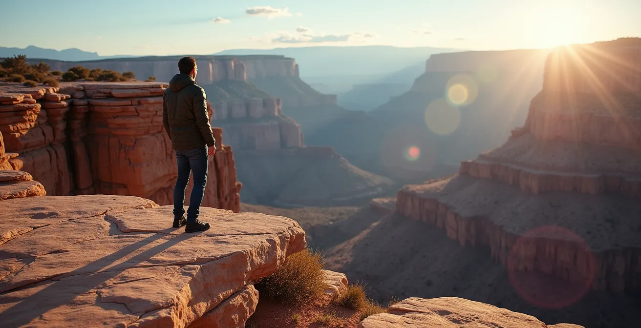
The conventional wisdom for aperture is simple: use a wide aperture like f/2.8 for portraits to blur the background and a narrow aperture like f/16 for landscapes to get everything in focus. This is technically correct but artistically limiting. A true master of composition uses aperture not just for exposure and focus, but as a primary storytelling tool. The choice between a shallow and a deep depth of field is a choice about context, relationship, and narrative.
Using a narrow aperture like f/16 is an act of crafting a “narrative aperture.” You are making a conscious decision that the environment is not just a backdrop, but an essential character in the story of your subject. This is the technique for an environmental portrait. Imagine photographing a geologist not against a blurred backdrop, but with the vast, sharp-in-focus canyon they study stretching out behind them. The deep focus of f/16 puts the person and their passion on equal footing. It tells the viewer, “This person belongs here. Their story is inseparable from this place.” It creates a dialogue between the figure and the ground.
Conversely, choosing f/2.8 is an act of isolation. It tells the viewer that nothing else matters except the subject. The world melts away into a creamy bokeh, focusing all emotional and visual weight on a person’s expression, a detail on a flower, or a specific object. This is powerful for creating intimacy and removing distractions. However, overusing it can lead to a portfolio of disconnected subjects floating in an abstract world, devoid of context or a sense of place. The tension in an environmental portrait comes from the viewer’s eye traveling between the sharp subject and the equally sharp, compelling world they inhabit. Your choice of f-stop is, therefore, a directorial one: do you want to tell a story of intimacy or a story of context?
How to Use Acting Techniques to Sell a Song You Don’t Feel?
This question seems out of place in a discussion of visual art, but it strikes at the very heart of our theme: artistic creation is about conveying an emotion, whether you personally feel it in the moment or not. Just as a photographer can use composition to create a feeling of tension in a placid scene, a musician can use acting techniques to deliver a powerful, authentic-seeming performance of a song they don’t emotionally connect with. The key is to shift from internal feeling to external, physical expression—a form of physical composition.
The Method actor’s trick is not to force an emotion, but to create a specific backstory for the character they are portraying. As a singer, you can do the same for the song’s narrator. Who is this person? What just happened to them before the song began? This act of “character creation” gives you a concrete emotional landscape to draw from, separate from your own. Another powerful technique is to use physical triggers. Before a sad verse, take a slow, heavy breath. Before an angry chorus, clench your fist out of the audience’s view. Your body can lead your voice where your heart can’t.
This idea of physical composition directly mirrors visual composition. In a fascinating parallel, performers can use their position on stage to create psychological effects, just as a photographer places a subject in a frame.
The Physical Gesture Method in Performance
Professional performers understand that the stage is a canvas. As noted in studies on performance, specific physical anchoring techniques are used to manipulate audience perception. Placing emotional weight at the edges of the performance space (or “frame”) creates a feeling of tension and discomfort. In contrast, occupying the dead center can create a dramatic, sometimes unsettling, effect. These are the exact same principles of psychological weight that govern visual composition, applied to a three-dimensional, live performance.
Ultimately, “selling” a song is not about faking it. It’s about being a skilled translator. You are translating the song’s inherent emotional code into a set of physical and vocal cues that the audience can read and feel. It is a technical, craft-based skill, just like choosing the right f-stop or balancing an exposure. It is the art of composing an emotional experience for someone else.
Why Does Drawing the Space Between the Arms Help You Get Proportions Right?
One of the most transformative breakthroughs for any artist learning to draw the human figure is the concept of “negative space.” Instead of trying to draw the arm itself, you focus on drawing the triangular shape of the empty space between the arm and the torso. Magically, the arm’s proportions become far more accurate. This isn’t a trick; it’s a profound neurological hack that bypasses the biggest obstacle to realistic drawing: your own brain.
Your brain is a symbol-making machine. When you think “draw an arm,” it pulls up a generic, symbolic idea of an arm, complete with preconceived notions of its length, shape, and thickness. You end up drawing the *symbol* of an arm, not the specific, unique arm you are actually looking at. This is why beginners’ drawings often have disproportionate, cartoonish features. But when you are asked to draw the abstract shape of the space *next to* the arm, your brain has no pre-existing symbol for that. It is forced to see the world as it truly is: a collection of abstract shapes, angles, and curves.
This technique is a practical application of the Gestalt psychology principle of figure-ground perception. By intentionally focusing on the “ground” (the negative space), you see the “figure” (the subject) with fresh, unbiased eyes. Artists who master this see the world differently. They don’t just see a chair; they see the shapes of the space under it and between its legs. This shift in perception is incredibly powerful, and studies on visual perception demonstrate a 40% improvement in accuracy when artists focus on negative space. The negative space becomes the subject.
Gestalt Figure-Ground Perception in Art
As explained by a deep dive into artistic perception, artists who focus on negative space (the ‘ground’) rather than the subject (the ‘figure’) effectively bypass their brain’s symbolic interpretation system. When drawing the spaces between limbs instead of the limbs themselves, artists are able to create more accurate proportions because they are simply drawing abstract shapes. They are not fighting against their own brain’s preconceived notions of what body parts “should” look like, leading to a more faithful and realistic representation of reality.
Key Takeaways
- Composition is a universal language, not a set of medium-specific rules; its principles of tension and balance apply to photography, drawing, and even performance.
- True artistic tension is created by intentionally breaking expectations—whether through unnatural light (HDR), selective focus (aperture), or by giving importance to empty space.
- The most powerful tools are often constraints, whether it’s the limited frames of a film roll or the challenge of drawing the space around an object instead of the object itself.
How to Capture the Gesture of a Pose in Under 30 Seconds?
Capturing the “gesture” of a pose is the primary goal of figure drawing. It’s not about rendering details or perfect anatomy; it’s about capturing the life, energy, and motion of the pose in just a few expressive lines. The ability to do this quickly—in 30 seconds or less—is a foundational skill that trains an artist’s eye to see the most essential information and ignore the rest. It is the purest form of compositional distillation.
A 30-second gesture drawing is an exercise in ruthless prioritization. You cannot possibly draw everything, so you are forced to identify the single most important line in the entire pose: the line of action. This is typically a flowing “S” or “C” curve that runs through the torso, from the top of the head to the weight-bearing foot. This one line contains the entire story of the pose—its rhythm, its balance, its energy. Everything else is built around it.
Once the line of action is established, the next few seconds are spent indicating the key angles—the tilt of the shoulders relative to the hips (the contrapposto), the angle of the head, and the general direction of the limbs. These are not detailed renderings; they are simple, confident lines that describe direction and relationship. The entire process is about seeing the body not as a collection of parts, but as a single, unified energetic form. This practice directly translates to photography, teaching a photographer to see the dominant lines in a landscape or the gestural arc of a subject in motion, and to frame their shot to emphasize that core energy.
30-Second Gesture Drawing Sequence
- 0-5 seconds: Identify and draw the primary line of action, typically a fluid curve through the spine.
- 5-10 seconds: Add the angle of the shoulders in relation to the hips, establishing the core twist or balance.
- 10-15 seconds: Place the head as a simple oval, paying close attention to its tilt and turn.
- 15-20 seconds: Indicate the limbs as simple, directional lines flowing from the joints.
- 20-25 seconds: Add basic volume with simple shapes like cylinders for limbs and ribcages for the torso.
- 25-30 seconds: Emphasize the distribution of weight and the points of contact with the ground.
Frequently Asked Questions About Compositional Discipline
Does shooting film really make you a better photographer?
Film forces pre-visualization and technical mastery due to delayed feedback and cost per frame, building stronger foundational skills that transfer to digital work.
How can digital photographers simulate film discipline?
Set a hard limit of 36 shots per outing, turn off LCD preview, and wait 24 hours before reviewing images to simulate the film development delay.
What’s the actual cost difference between film and digital per image?
Film costs approximately $0.50-1.50 per frame including development, while digital costs are negligible after equipment purchase, creating different psychological pressures.